TexasPGB logo artwork

Blog Layout

How to Use PowerBI to Overcome Data Blindness

Chelsea Sauder • Feb 27, 2020
The McKinsey Global Institute indicates that data-driven organizations are 23x more likely to acquire customers, 6x as likely to retain customers, and 19x as likely to be profitable as a result. 

There is no argument that data is important to business, but what happens when it becomes a distraction to your team?
Data Driven Business Statistics
With today’s technology, companies have access to a wealth of information. If you can think of it, you can track it. This unlimited access to data is a double-edged sword. Often in the course of harnessing data, organizations overwhelm their team with excess and irrelevant information for their role.
 
Banner Blindness is an advertising phenomenon that occurs when consumers are so inundated with display ads that they become unaware of the messaging. A poorly designed business intelligence system can create what we have dubbed “Data Blindness”. Data Blindness occurs when users are exposed to so much data, they mentally cannot process the details and fail to recognize critical information.
Data Blindness occurs when users are exposed to so much data, they mentally cannot process the details and fail to recognize critical information.
Microsoft Office 365 Power BI

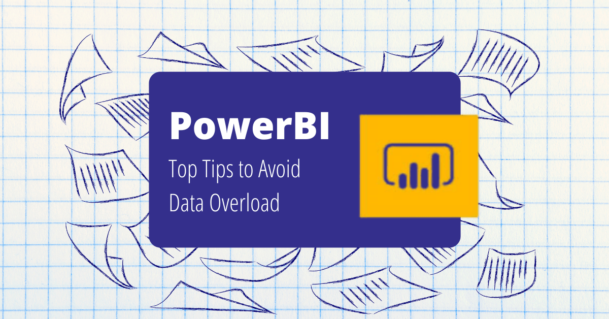
When used effectively, data visualization tools and business intelligence platforms can increase data delivery while limiting Data Blindness. For our clients, Microsoft Power BI is our go-to business intelligence program. Power BI enables companies to create dynamic dashboards and provide self-service analytics to the entire organization. As part of the Microsoft Power Platform (Power BI, Power Apps, Power Automate) Power BI works in conjunction with the other applications to drastically change the ways a business collects, displays, and disseminates data. 


Below are some of our favorite tips to prevent Data Blindness when using Power BI. 

Utilize the MAD Framework
The first step in avoiding Data Blindness is making sure the right people see the right information at the right time. The Data Warehousing Institute (TWDI) came out with the MAD Framework as the optimal way to design business intelligence delivery. When used correctly, it gives users the right type of information in a way they can digest with the fewest clicks.

What is the MAD Framework?
The MAD Framework consists of 3 layered BI functions: Monitor, Analyze, and Detail. The MAD Pyramid shows how each functional layer has an ideal target audience, information type, and desired outcome. Companies looking to create or improve data driven dashboards can use the MAD Framework to identify KPI’s, visualizations, and types of reports needed by role to factor into their overall dashboard strategy. 
TWDI MAD Framework for Business Intelligence Delivery
Tachometer Data Gauge Microsoft PowerBI

Monitor:

The monitor layer should provide a clear at-a-glance overview of the business using graphical KPI’s. Executives and senior level management are most likely to view this layer of information to identify trends that may require further investigation. For example, if the company sells a variety of products the monitor layer may highlight a decline in overall sales. 


Power BI Tool Tip: Power BI marketplace has a variety of Power BI visual apps to help create clean graphics and charts for your dashboards. A great visual tool to use on the monitor layer of your Power BI dashboard is the Tachometer. With the Tachometer, you can display variable performance against high, low, and acceptable levels of measurement such as units sold or leads generated.  

Enlighten Slicer Data Filter Microsoft PowerBI

Analyze:

The analyze layer allows users to view KPI’s from a variety of perspective using custom views and filters. Mid-level Managers and analysts can use this layer to identify the root cause affecting the performance of a KPI. For instance, if the monitoring layer unveiled declining sales, a user in this layer may identify that out of all their offerings (initial purchase, upsells, fees, etc), upsells have significantly decreased. 


Power BI Tool Tip: The Enlighten Slicer tool allows users to add an interactive and visually appealing filter to their Power BI dashboard. With this tool, you can display data based on a specific variable such as product type, industry, etc.


Drill Down Bar Data Microsoft PowerBI

Drill:

The drill layer focuses on operational queries and reports to drill down to the atomic level details of the business. Analysts and front-line staff can use this layer to identify the exact locations, products, people, etc that may be affected by a specific trend. If decrease upsells have been affecting overall sales performance, this layer could identify if a specific location, worker, marketing initiative, etc. was responsible.  


Power BI Tool Tip: The Drill Down Combo Bar PRO by ZoomCharts allows users to interactively drill down the information from a bar chart with a click of a button. This tool can be used to show sales by region at a glance and then users can click on each region to see more details such as sales by state in a specific region.


When creating your Power BI environment from the MAD framework keep the following in mind:
  • Use Row Level Security (RLS) to create role-based permissions and make sure users have quick access to the information relevant to their needs
  • Subscribe users to appropriate reports and dashboards to receive information via email on an hourly, daily, weekly, monthly basis
  • Use query string parameter syntax to share a report with team members with preset filtered views

Break up data and reduce clutter with visuals

You can prevent Data Blindness by reducing the visual “noise” on a specific page. A strong visual design creates a balance between graphics, numerical data, and text. We’ve already mentioned a variety of visual apps from the Power BI marketplace that can be used to help display complex information in a concise manner. 

Below are a few more of our favorite apps to incorporate into your Power BI dashboard:
Chiclet Slicer
  • Description: Display image and/or text buttons that act as an in-canvas filter on other visuals
  • When to use: Use the chiclet slicer and cross highlighting functionality to filter reports with images such as products, industry icons, etc.
Chiclet Slicer Microsoft Power BI Visual App
Sunburst Chart Microsoft Power BI Visual App
Sunburst Chart
  • Description: An interactive donut chart to visualize hierarchical data, depicted by concentric circles.
  • When to use: Hierarchical datasets are perfect to display when natural groupings exist within multiple layers of the data. For example, show your revenue story broken down geographically by regions (ex. Country > Region > State > City)
Gantt Chart
  • Description: A bar chart that illustrates a project timeline with assigned resources
  • When to use: Gantt charts are great to display in project reports when multiple resources are required that may result in potential bottlenecks
Gantt Chart Microsoft Power BI Visual App
Word Cloud Microsoft Power BI Visual App
Word Cloud:
  • Description: Creates a visual representation based on a word’s frequency and value
  • When to use: The word cloud can be a great at-a-glance tool when trying to identify key words. For example, track your social media performance and show which hashtags have the highest engagement
Power BI should not be used in a silo
If users are suffering from Data Blindness because of the amount of data in one place, find creative ways to disseminate critical data. A key advantage to the Power BI platform is that it can be incorporated throughout the rest of the Microsoft Power and Office365 platforms. A successful business intelligence program takes advantage of the entire digital workspace. 

A few ideas for getting the right data seen are:
  • Use Power Automate to send email alerts to users when a data event is triggered
  • User Power Automate to send a text alert when a data event is triggered for urgent triggers such as low inventory
  • Add your Power Apps to Power BI so users can take immediate action on the insights they gain while in a report
  • Add Power BI tiles to display specific information within your Power Apps
Microsoft allows users to create a multi-faceted business intelligence landscape. When your Microsoft applications are integrated thoughtfully, users move from simple data absorption to data driven actions. To move your team from Data Blindness to data-driven contact TexasPGB today!
Drive Your Business Today!
Share this post with others:
19 Aug, 2021
When it comes to automating processes around your business, it can simultaneously seem like everything can be automated, and absolutely nothing can be automated. As with many other things, the real answer is somewhere in the middle but can be a bit challenging to put your finger on. These projects usually start when someone at the strategic level of the organization has decreed that “we are going to automate!” and either they personally go on the hunt for what to automate or they hand it off to someone on their team to go do the leg work and come back with “automation” (maybe in a nice box with a bow on it). Sound familiar?
17 Aug, 2021
Data is everywhere. You’ve got a lot to focus on and it can be hard to stay on top of what’s going on with your business. Report creation in Excel is often time-consuming and can quickly become a nightmare. Modernizing your reports and streamlining your process with PowerBI to get more reliable and consistent reporting across all of your systems can be a game changer for your business. Read on to learn about three key acceleration tactics that our team uses on every implementation that we facilitate.
Infographic: How to Save time and Money with Microsoft Teams
By Patrick Boren 08 Feb, 2021
83% of knowledge workers require technology to work together. Microsoft Teams is a cloud-based collaboration and communication tool that lets workers share the right information to the right people all through one integrated platform. According to a Forrester report, The Total Economic Impact of Microsoft Teams, there are a variety of ways using Teams saves organizations time and money. Read and download the infographic to share here .
Top Features of the Power Automate App for Teams by Microsoft
By Patrick Boren 22 Jan, 2021
How to Get Started with the Power Automate app for Teams You can get started with Power Automate app in just 3 quick steps:  Click on the … in the left-hand corner of your teams browser Search for “Power Automate” Click on the Power Automate app icon and pin it to your left-hand Teams navigation panel
What Are Your TOP 3 Processes To Automate In 2021
By Patrick Boren 18 Jan, 2021
As mentioned, there are several options available for automating your business. One of our favorite low-code/no-code options is the Microsoft Power Platform. As a suite of 4 different tools, the Power Platform can automate routine tasks, customer support, data visualization, and more. A few highlights on the effectiveness of the Power Platform are:
Top Microsoft Solutions to Watch in 2021
By Patrick Boren 06 Jan, 2021
It is no secret that 2020 and the coronavirus pandemic altered the reality of doing business. These changes are showing little signs of letting up and a lot of the adjustments made to respond to a remote workforce may very well become a permanent feature in daily business operations. As business decision makers (BDMs) and IT decision makers (ITDMs) head into a new year it is important to keep an eye out for technology solutions that can further support these operational changes while increasing efficiency. This post briefly highlights the top 3 digital solutions we have our eyes on for 2021 and our Microsoft-based clients.
Video Webinar Introducing Microsoft 365 Dynamics Project Operations
By Patrick Boren 31 Dec, 2020
In our latest video series, Patrick Boren, Principal Consultant at TexasPGB, introduces the newest addition to the Microsoft Project family, Microsoft Project Operations. In this video Patrick discusses: What challenges Project Operations aims to solve What is Project Operations and common use cases for the tool Who uses Project Operations Upcoming "Day in the Life" Sessions Watch the video or read the condensed transcript below.
Top Tips on How to Use Microsoft PowerBI to Avoid Data Overload
By Patrick Boren 19 Nov, 2020
Having a wealth of data at your fingertips is great, but what happens when your data is so vast that it takes you years to make a key discovery? A friend of mine told me a story recently about an experience he had. His first company conducted a VP meeting every quarter – everyone scrambling to put together their presentations and make their case based on the data from Excel spreadsheets. Departments and information tended to be segmented into silos. While much of the data could be shared across the company, rarely was it compiled in a way to show how one area of the business could affect another.
Solution Design SharePoint vs Common Data Service
By Patrick Boren 12 Nov, 2020
If you are looking to migrate your data to Microsoft 365 there are two common methods to funnel your data - SharePoint or Common Data Service (CDS). SharePoint solutions take advantage of lists and libraries. Data is housed, originated, and manipulated entirely within the SharePoint platform. CDS solutions use both standard and custom entities to collect and house data that is then integrated across the Microsoft 365 platform. Below we will review a few ways each method is different and what you should look for before making a final decision for your data migration plan.
How managed service providers and technology consultants are different and why you need both
By Patrick Boren 15 Sep, 2020
When it comes to technology, do you have a one-size-fits-all vendor? In today’s world of cost cutting, we see more and more organizations that end up missing out on huge technology opportunities by assuming a single vendor can and will do it all.  As a technology consulting firm, we’re frequently asked “aren’t you the same as my managed service provider (MSP)?” Fortunately, for those that ask, we’re able to shed light on how a Technology Consulting Firm varies from an MSP.
More Posts
Share by: